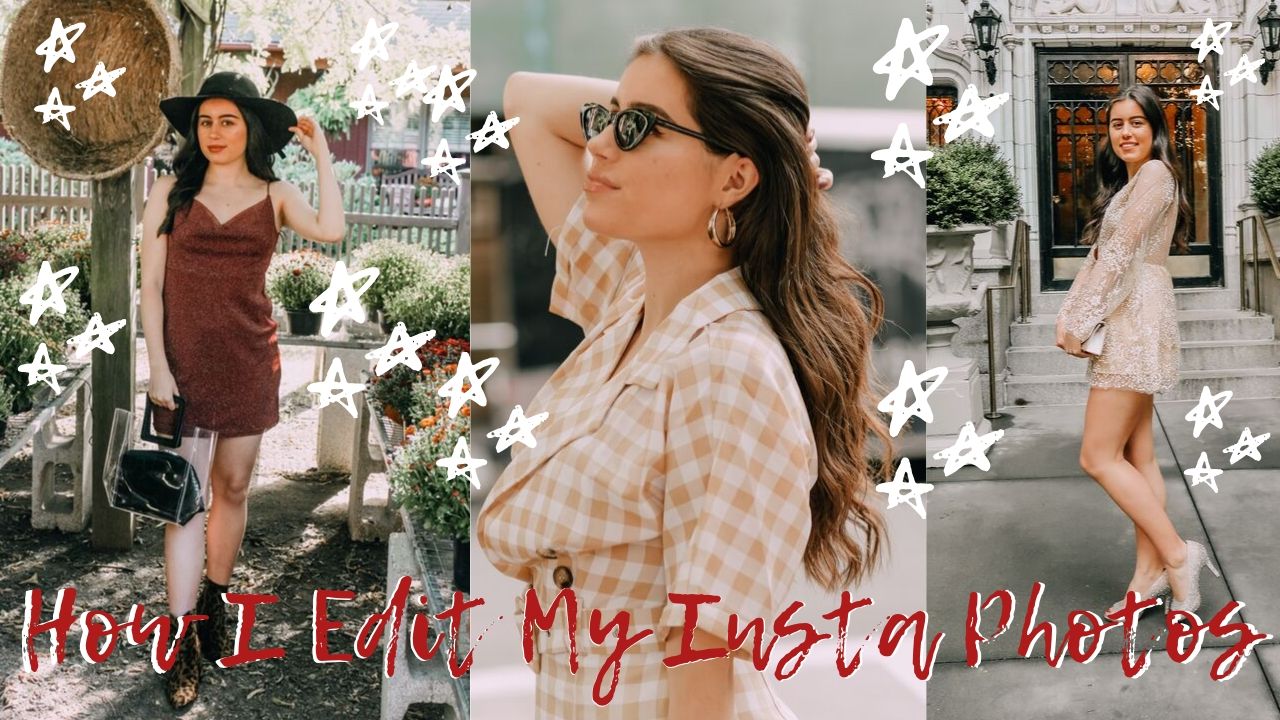

Last week I asked my Instagram followers if they’d like to see a blog post and a YouTube video about how I edit my photos using Lightroom and I was surprised at how many people are interested. I’ve been asked by a few people now about how I edit, and I’m always thankful for the sweet comments because I spend a lot of time on my photos. Just a little disclaimer that I’m not a photographer by any means but I have a fond appreciation for the craft and I’ve dedicated countless hours to learning how to improve my shooting and editing skills over the years. This is how I edit my photos for Instagram with Lightroom.
Download Adobe Lightroom + Aspyn Ovard Presets

The first step you should take is to download Adobe Lightroom. For an Adobe Lightroom subscription, it costs $9.99 a month. If you’re new to photography, I would recommend purchasing this software first before investing in the entire Creative Cloud subscription. Next, you will want to purchase Aspyn Ovard presets. I’ll be honest, her photo presets are pricey. They cost $75, but I absolutely love them and would recommend buying them if you truly love the way she edits. However, if you can’t afford to buy such a high price (which is totally understandable) then I would recommend searching for them on Google. Plenty of people have uploaded similar presets or the exact ones. I also found the mobile package on Etsy, so I’m going to link those for you too.
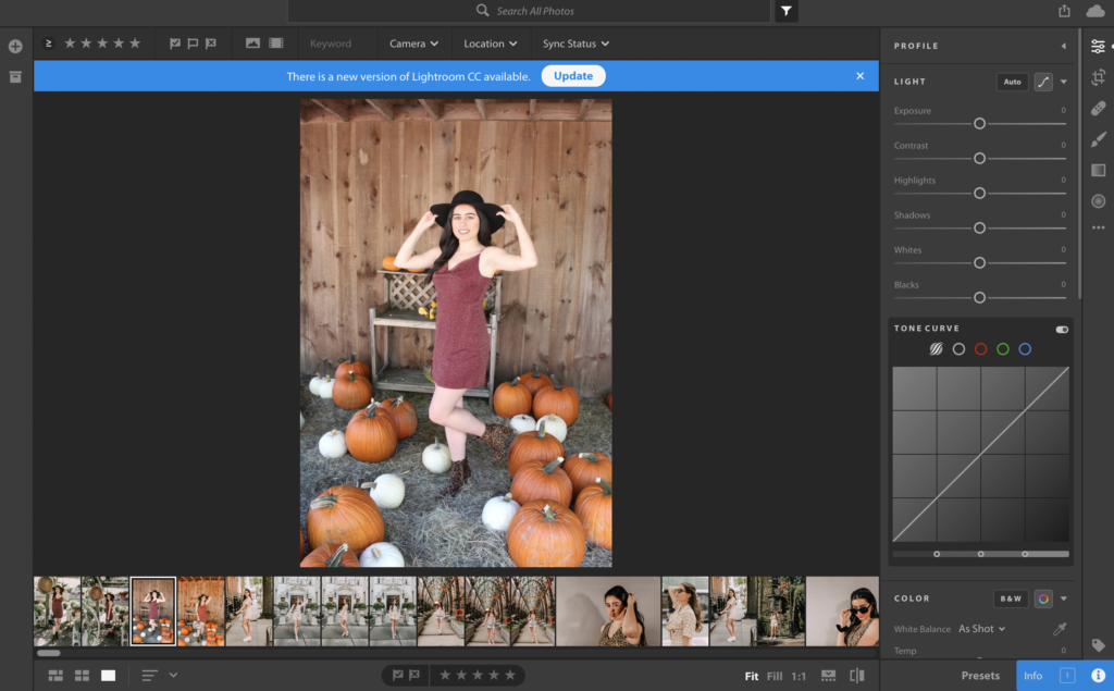
Upload a Photo + Choose Beachy Preset
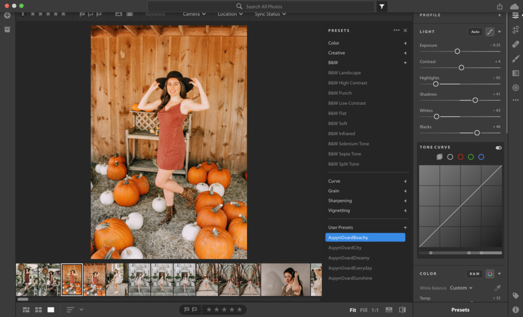

The next steps you’ll want to take are uploading a photo of your choice, preferably a raw file, and then select the beachy preset. This is the orangey, saturated preset. When you first select the preset, it’s going to look very orange but by the time you’re done editing, it will look perfect and much more natural.
Color Noise Reduction, Noise Reduction + Sharpen Image
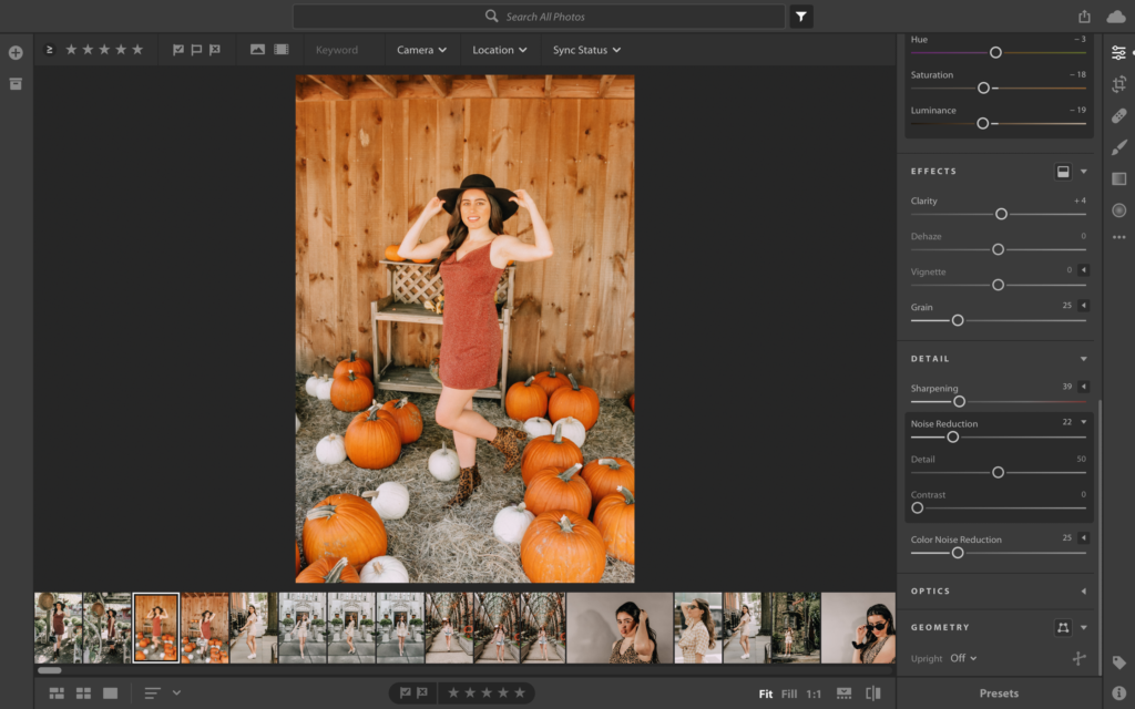

Scroll to the bottom of the editing features. I find it easiest to start from the bottom because I want to see how these features look once I adjust the saturation and temperature later on. For the color noise reduction feature, I leave it as is at +25. Next, click on the noise reduction feature and move it to +21. I like to increase the noise reduction to sharpen my photos. After that, I sharpen my photos to +39. Sharpening makes a huge difference in the photo’s appearance, and it looks more professional.
Grain, Vignette, Dehaze + Clarity
Personally, I do not like grainy photos. I think a little grain is nice to give a vintage feel but usually, I turn it down to 6. I don’t touch the vignette or dehaze features. To be honest, I don’t really know what these do, but I do know that I like how my photos look without them. Next, I will increase the clarity anywhere from +15 to +20. Clarity is similar to the sharpen feature where it makes the photo pop.
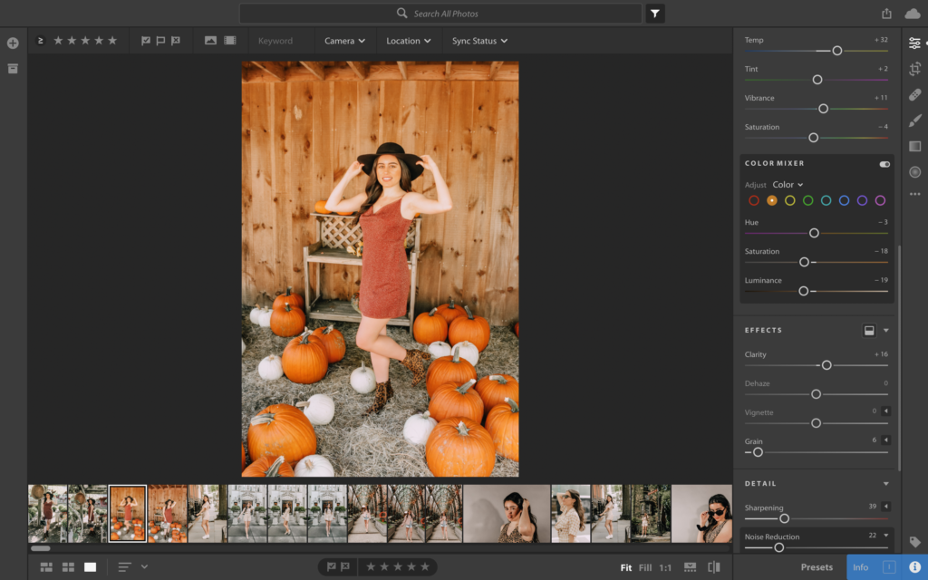
Color Mixer

The color mixer features are left as is. I don’t remove or add any colors, so this step is basically skipped by me. I do put the luminance down to -12 and it brightens the photo but otherwise, I don’t use the hue or saturation features here.
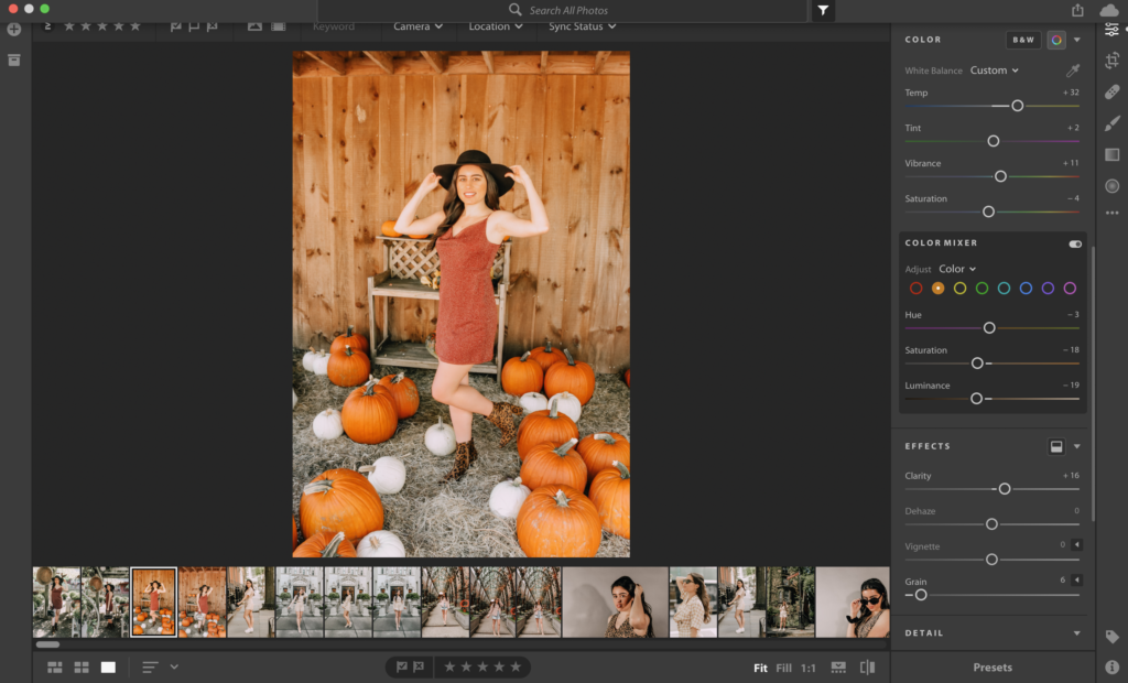
Saturation, Vibrance, Tint + Temperature
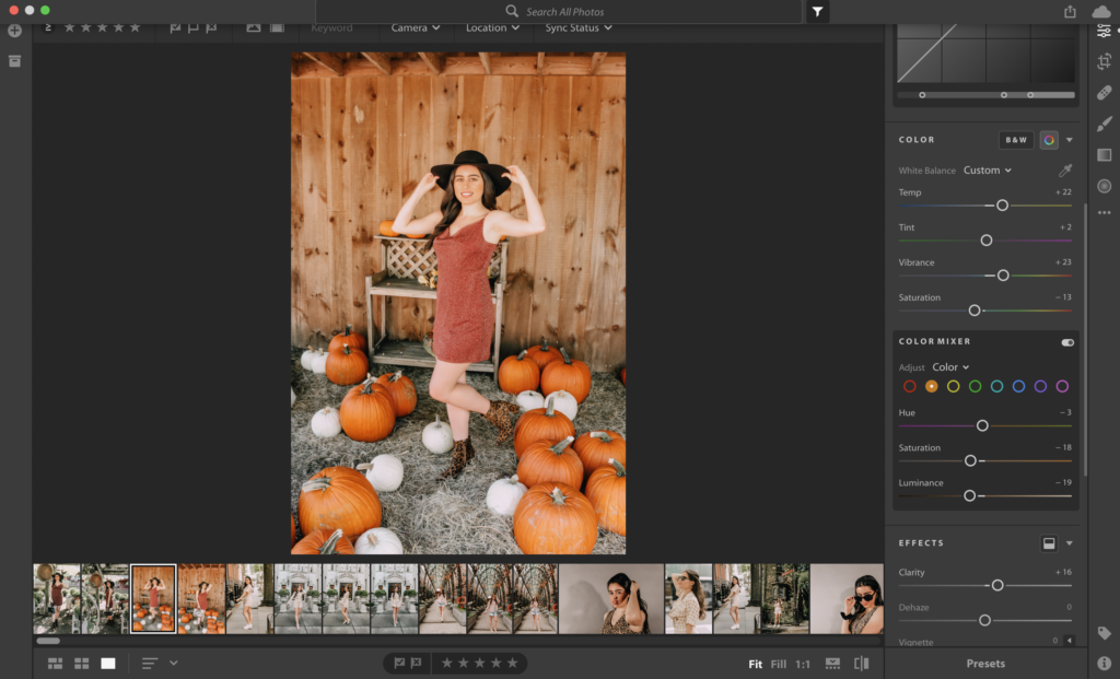

I lower the saturation by a lot to avoid my photos from looking orange. I made the mistake of not doing this when I first started using these presets and it made my photos look fake. However, do not turn it down too much, or your photo will have a blueish-grey tint. I usually keep it to -13. I also like to increase the vibrancy so my photos turn out bright and colorful. Mine goes up to +23, and it makes the colors in the photo pop. I don’t adjust the tint at all. Lowering the temperature is another extremely important step or your photo could look too yellow. I usually lower the temperature to +22.
Blacks, Whites + Shadows
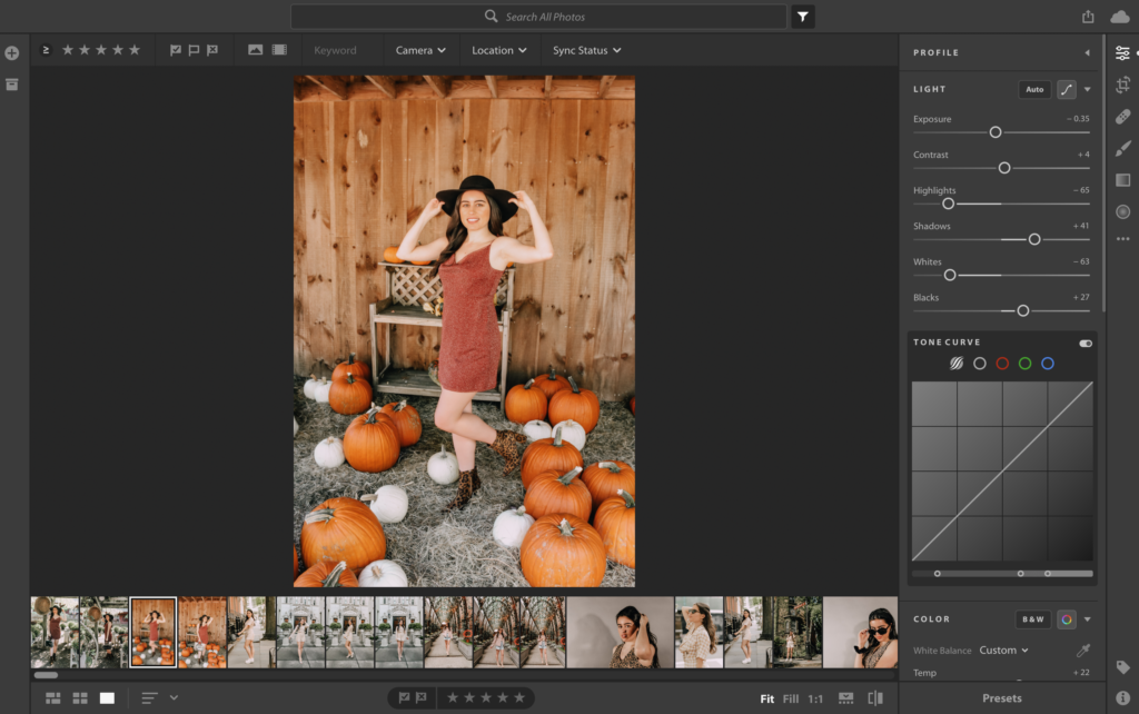

Usually, I lower the blacks a lot in my photos because I don’t like for them to be dark. In this particular photo, I’m going to set the black feature to +27 to show off some of the colors in the background. The whites are adjusted a little because I never want my photos to look overexposed. I left the whites on -63 in this case. I also turn the shadows down just a little too to lighten my photo. I’m setting it to +41 here.
Highlights, Contrast + Exposure
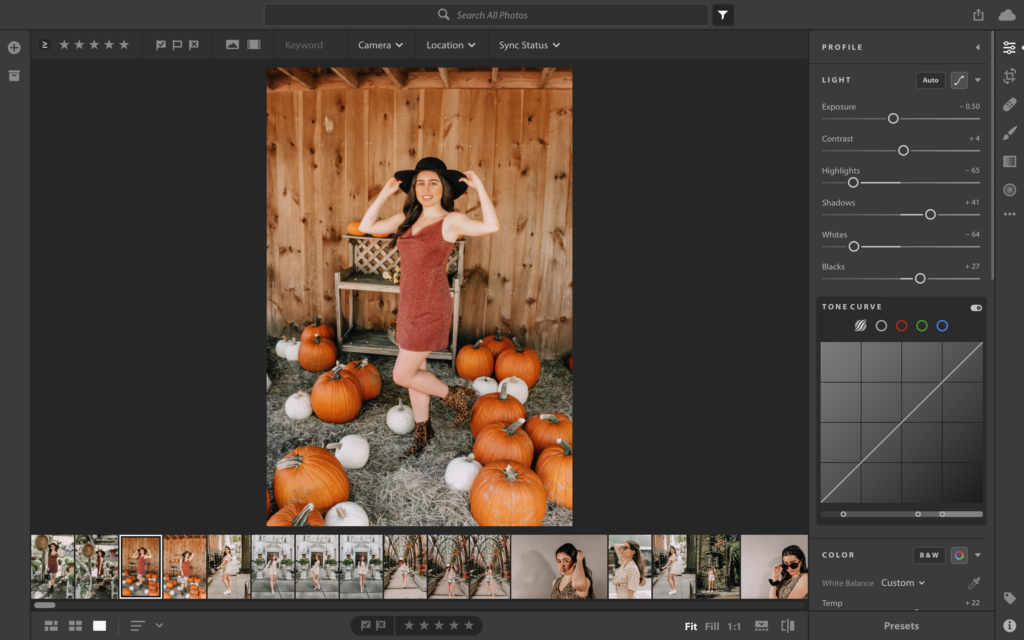
I don’t always touch the highlights. I don’t like my photos to be too bright. Instead, I like to improve the natural lighting that is already present in the photo. In this case, I left the highlights as is, so it’s set to -65. I don’t touch the contrast. The photo preset has it automatically set to +4, so I left it alone. Lastly, I set the exposure to -50. The exposure is another important feature because you don’t want the photo to be too dark. Don’t overdo it, though, or you will wash out the natural color and lighting.
Thanks so much for reading! I hope this helped you understand Lightroom. Check out the corresponding video down below.
https://www.youtube.com/watch?v=-Qy3OUUSXe0